By CASA Collection Group
Color is one of the most powerful tools we have for shaping how a home feels, yet it is one of the easiest to overlook entirely. The right palette can make a room feel calm, energizing, or effortlessly elegant, often before we consciously notice why we respond the way we do. Understanding even a little about how color works helps you design every space with real intention rather than guesswork. Here is my guide to using color psychology in your home to transform the way each and every room feels.
Key takeaways
- Color shapes the mood of a room before we even realize it.
- Cool tones like blue and green create calm, restful spaces.
- Warm tones bring energy and warmth to social rooms.
- Neutrals offer a timeless, flexible foundation for any home.
Understand what color psychology is
Color psychology is simply the idea that different colors influence how we feel in a space. We respond to color emotionally and often unconsciously, which is exactly why one room can feel soothing while another feels energizing. Once you understand this basic principle, you can begin to choose colors that actively support how you want each space to feel. It turns color from a decorating afterthought into one of your most powerful design tools.
The basics to keep in mind
A few principles guide almost every choice:
- Cool colors tend to calm, while warm colors tend to energize.
- Lighter shades open a space up, and darker ones make it cozy.
- Context matters, since light and finishes change how color reads.
- Personal response always matters more than any rule.
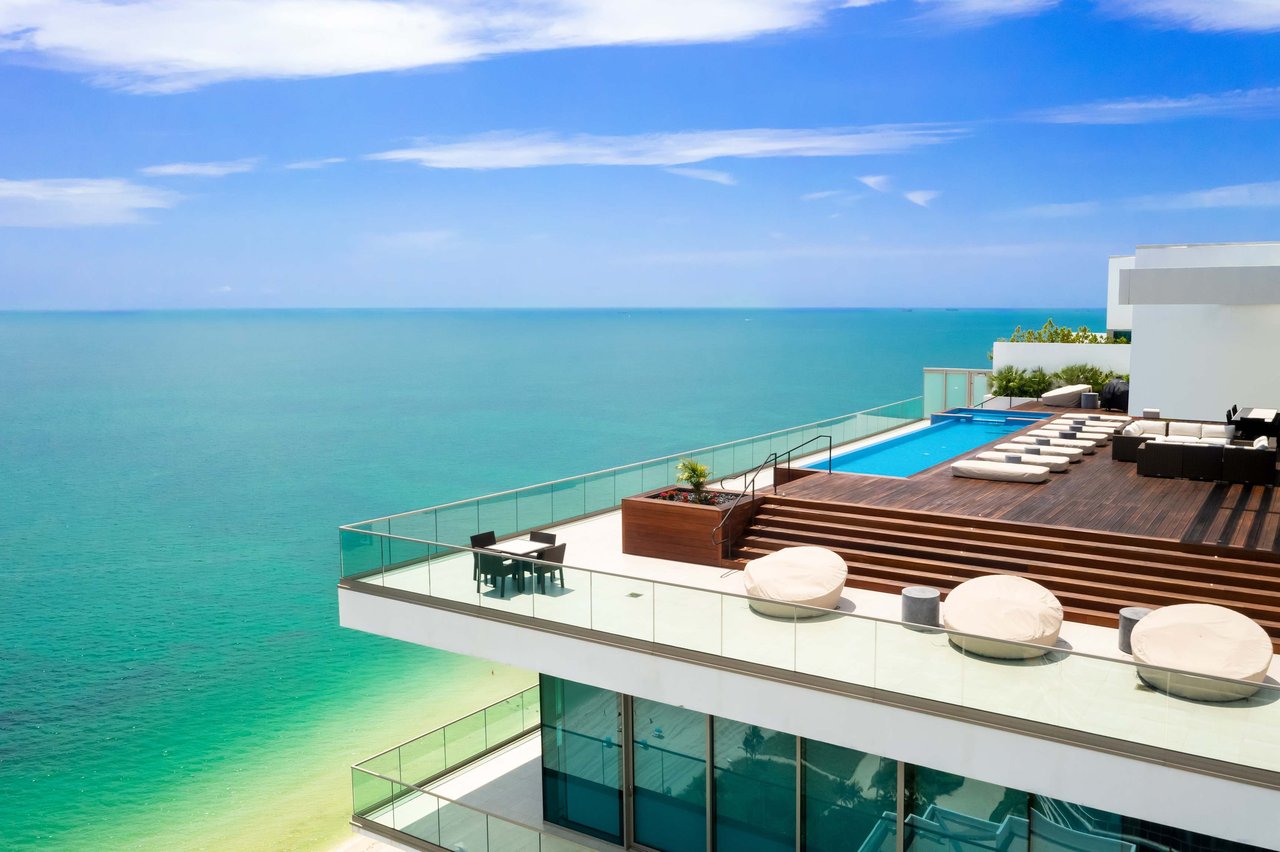
Choose calming blues and greens for restful spaces
When I want a room to feel genuinely peaceful, I turn to cool tones almost every time. Blues and greens echo the water and sky that surround us here in
Miami Beach, and they bring a natural, effortless sense of ease indoors (learn more in our guide on
timeless design tips for your Miami Beach home). These shades are ideal for the spaces where you go specifically to rest and recharge. They have a quieting effect that is hard to achieve any other way.
Where cool tones shine
I love using blues and greens in:
- Bedrooms, where rest and calm are the goal.
- Bathrooms, for a spa-like sense of serenity.
- Reading nooks and quiet retreats.
- Any space meant for slowing down and unwinding.
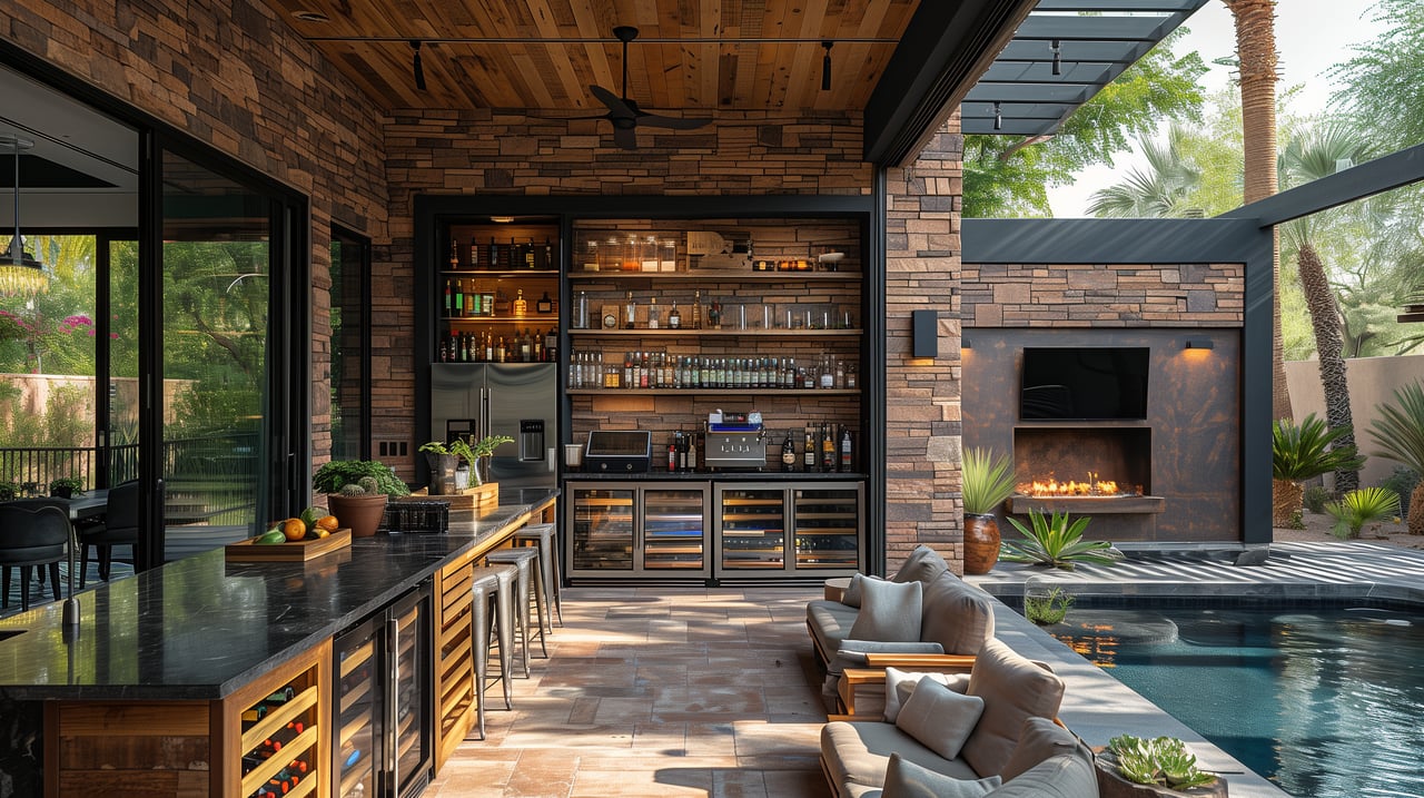
Use warm tones for social, energizing rooms
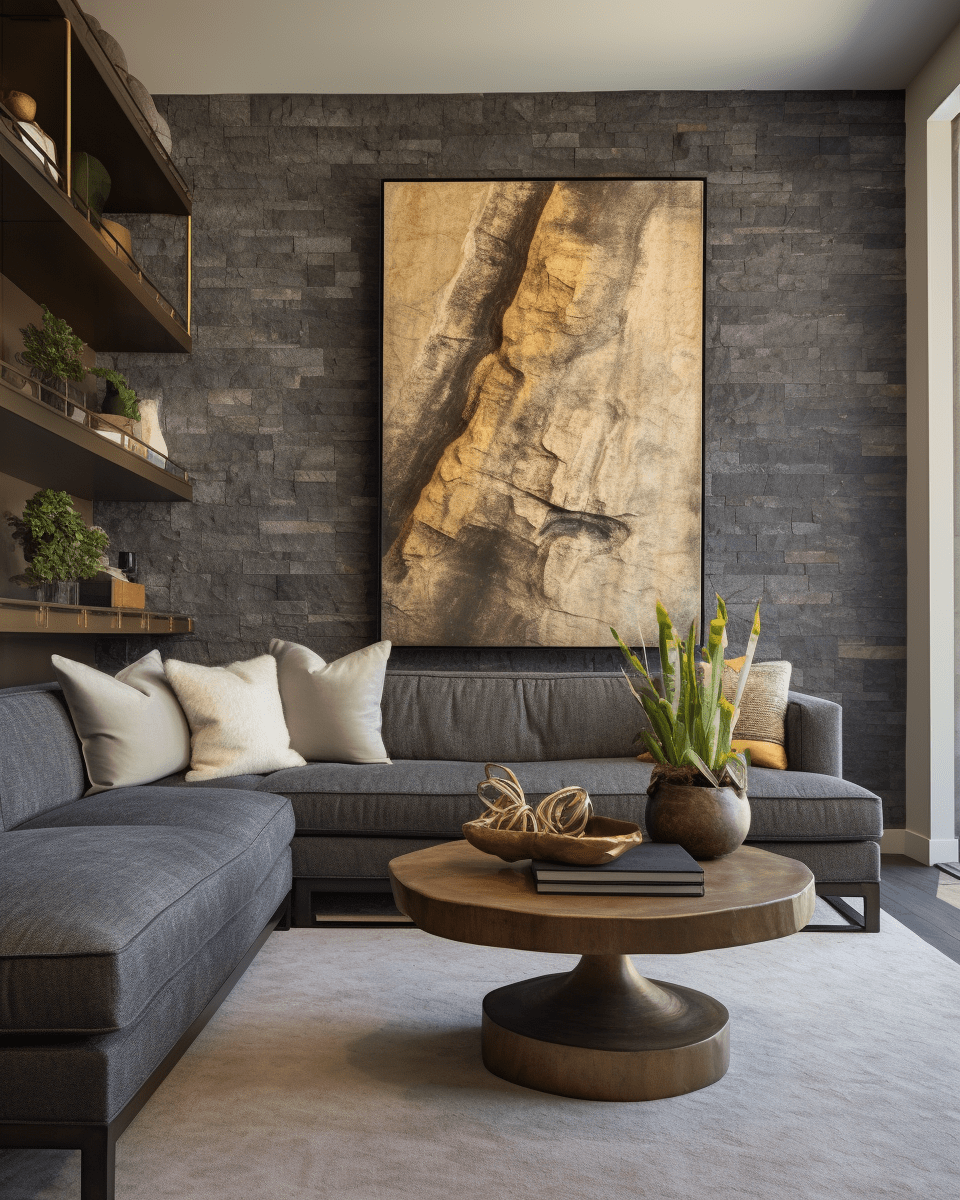
Warm colors invite connection and conversation, which makes them wonderful for the spaces where people gather. Tones like terracotta, warm neutrals, and soft golden accents add energy and a welcoming glow to a room. They help a space feel alive, sociable, and inviting the moment you walk in. Paired with cohesive
interior design styles for your Miami Beach home, warm tones create an environment where people love to linger and feel at home.
Where warm tones work best
Consider warmer shades in:
- Living and dining rooms where people come together.
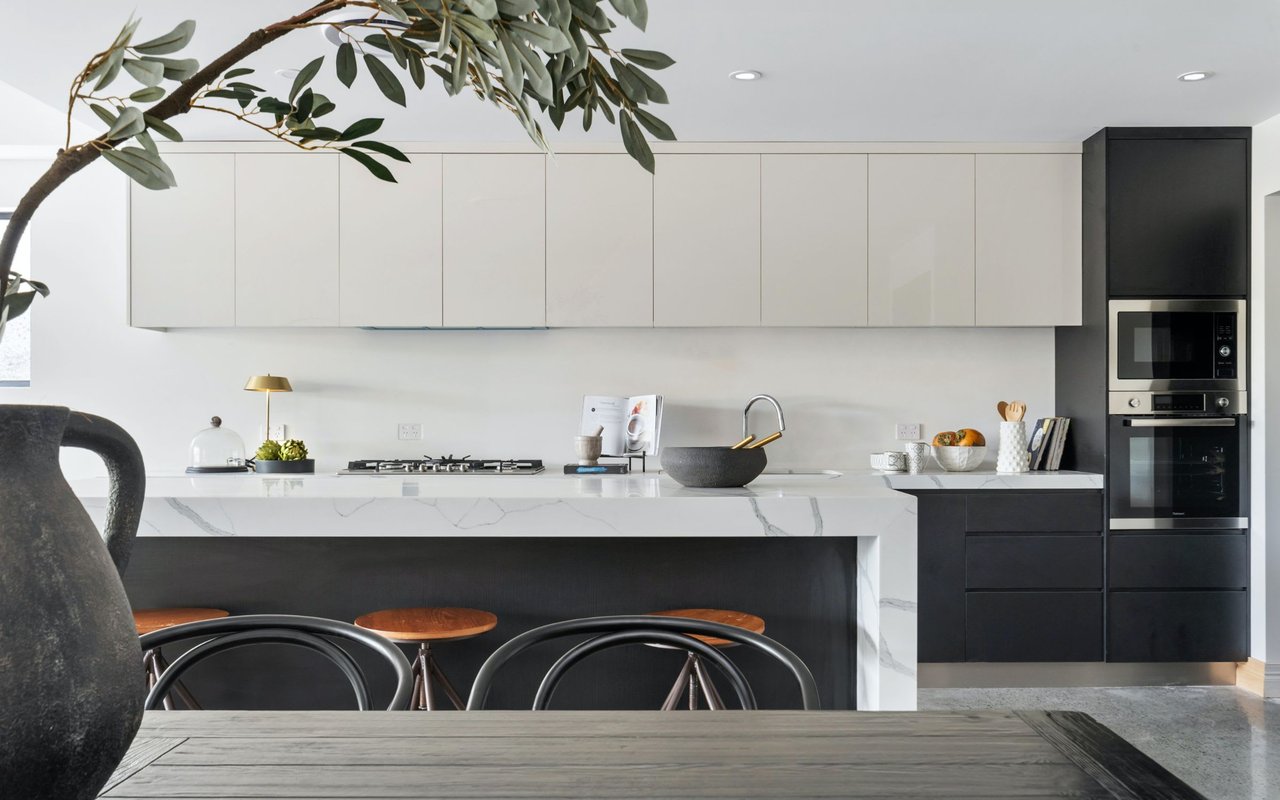
- Kitchens, the natural heart of the home.
- Entryways that set a welcoming first impression.
- Spaces where you want energy and warmth to flow.
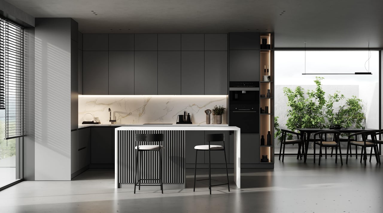
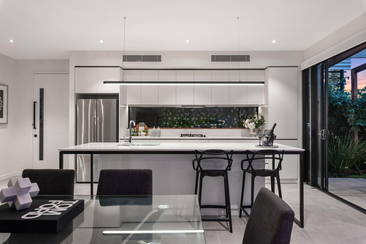
Build on a foundation of neutrals
Neutrals are the quiet workhorses of good design, and I rely on them constantly. They create a timeless backdrop that lets everything else in the room shine, and they simply never go out of style (check out our
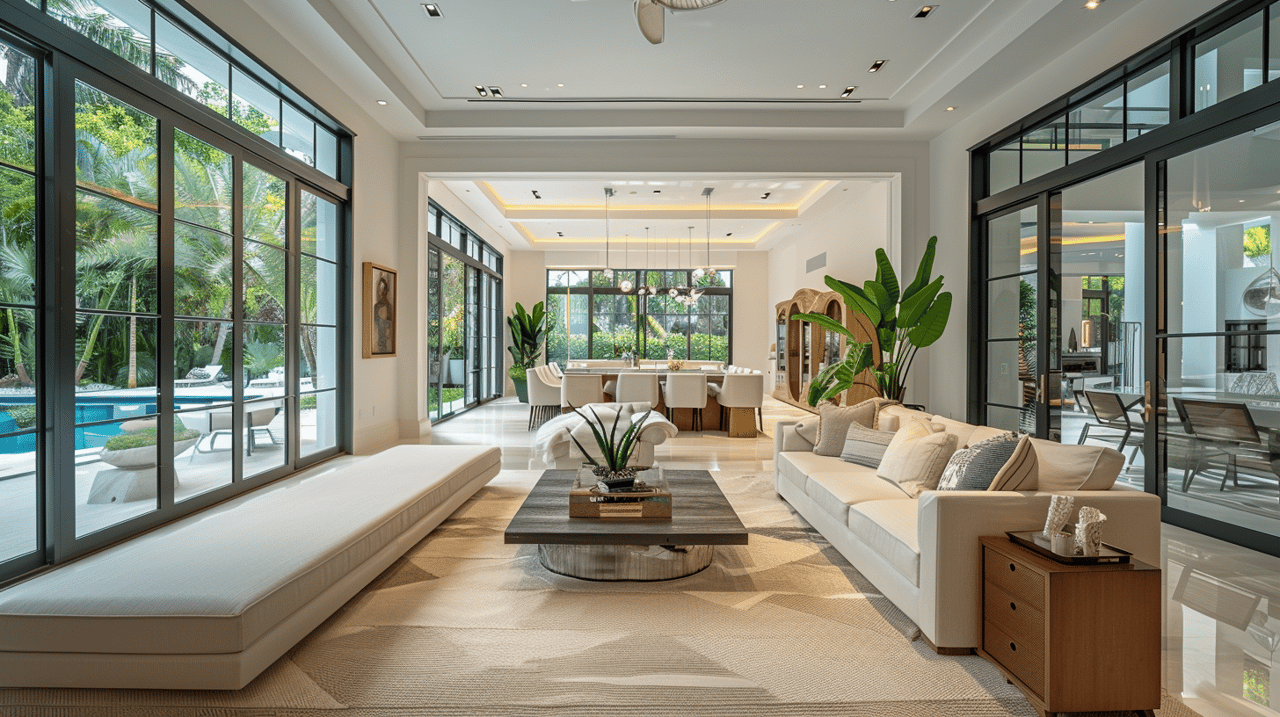
tips for decorating your Miami Beach home). Building on a neutral base also gives you the flexibility to evolve a room over time without starting from scratch. It is the most forgiving and lasting foundation you can choose.
How to use neutrals well
To make neutrals work for you:
- Choose warm whites and soft tones for an airy feel.
- Layer different textures to keep neutral rooms interesting.
- Use neutrals as a canvas for bolder accents.
- Vary the tone slightly from room to room for depth.
- Let natural light bring warmth and life to the palette.
Put color to work with confidence
Understanding color is one thing, and using it well in your own home is another entirely. A few simple habits make it far easier to get right and far less intimidating. The goal is a home that feels cohesive and intentional as you move from room to room, rather than a series of disconnected choices. With a little care, anyone can achieve that sense of flow.
Tips for choosing color
As you plan your palette:
- Test colors in your own light before committing.
- Let a color flow between connected spaces for cohesion.
- Start with accents if a bold choice feels daunting.
- Trust how a color makes you feel above all else.
Frequently asked questions
What colors make a room feel calm?
Cool tones like soft blues and greens are the most calming of all, which is exactly why they work so beautifully in bedrooms and bathrooms. They naturally evoke a sense of rest and serenity, especially here where they echo the water just outside.
What colors are best for a living room?
Warm, welcoming tones tend to work best in social spaces, since they naturally encourage connection and a sense of energy. That said, a well-chosen neutral layered with warm accents is always a timeless and flexible option that suits nearly any home.
How do I start using color if I am nervous about it?
Begin with easy accents like pillows, art, or a single accent wall to test the waters. This lets you enjoy the real effect of color without committing to a whole room right away, and you can adjust as your confidence grows.
Reach out to CASA Collection Group
The way a home makes you feel is truly at the heart of what I do, and color is one of the most personal parts of that entire experience. From
Miami Beach condos to sprawling
waterfront estates, I love helping clients see a home's full potential and imagine how it could feel as their own.
Reach out to me, Marco Tiné, at
CASA Collection Group, whether you are searching for a new home or simply reimagining the one you already have. I would love to help you create a space that feels exactly right for the life you want to live in it.
Related Blog Posts